Teleoperate with a custom control interface
You can remotely operate any configured machine and visualize and aggregate its data using a custom control interface.
Prerequisites
Create a workspace
Navigate to the FLEET page’s TELEOP tab. Click + Create workspace.
Enter a unique name for your workspace in the top left of the page, replacing the placeholder
untitled-workplacetext.Use the Select location dropdown to select the location that contains the machine that you would like to visualize data from.
Use the Select machine dropdown to select the machine that you would like to visualize data from.
Add a widget
Click Add widget and select a widget type to create a new widget on your workspace.
See widget types for more information about each type.
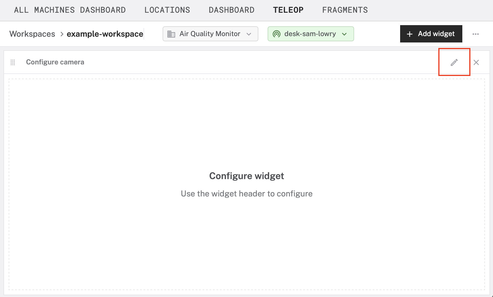
To configure the widget, click the pencil icon in the top right of your widget:

You can mix and match multiple widgets to visualize many kinds of data collected by your machine:

To arrange widgets on your workspace, click and drag the grid icon in the top left of your widget:

Widget types
Viam provides the following types of widgets that you can customize to visualize data synced from your machines:
Actuation
The actuation widget allows you to operate actuating components:

To configure the actuation widget:
- Choose a type from the Component type dropdown.
- Choose a method from the Method dropdown.
- Choose a component from the Actuating component name dropdown.
- Click Save.
Camera stream
The camera stream widget displays a live feed of the most recent image captured by a camera component:

To configure the camera widget:
- Choose a camera from the Camera name dropdown.
- Select the Refresh type.
- Click Save.
GPS
The GPS widget displays the current GPS location of any sensor that reports a position:

To configure the camera widget:
- Choose a movement sensor from the Movement sensor name dropdown.
- Specify the Refresh rate in seconds.
- Choose to include Historic positions.
- Click Save.
Stat
The stat widget displays the most recent reading recorded by any sensor that produces tabular data:

To configure the stat widget:
- Choose a sensor from the Sensor name dropdown.
- Select the reading you would like to display from the Path dropdown.
- Assign a title, a unit suffix, and a refresh rate.
- Click Save.
Table
The table widget displays a grid of historic tabular data values. You can display multiple fields simultaneously in a single table. Each row in the table represents a separate historic reading; each column represents a field.

To configure the table widget, define the following attributes:
From the Resource name dropdown, choose a sensor you would like to visualize.
From the Capture method dropdown, choose a method of data capture (for example Readings).
Specify the Refetch rate in seconds.
Specify the Time range in seconds.
Use a custom MQL aggregation pipeline stage (or series of stages) to transform your sensor data into a flat object where each field corresponds to a column for the table. Consider the following sensor data, which contains information about air quality in a field named
readings:"data" { "readings": { "gas_resistance": 114978.66606781945, "temperature": 22.96, "pressure": 1016.18, "humidity": 48.318 } }To change the displayed names, use a
$projectstage:{ "$project": { "Air Quality": "$data.readings.gas_resistance", "Humidity": "$data.readings.humidity", "Temperature": "$data.readings.temperature" } }For more information about MQL aggregation operators, see the MongoDB documentation.
Click Save.
Time series
The time series widget creates a graph of tabular data. You can add multiple lines to the time series widget to compare multiple readings over the same time period:

To configure the time series widget, define the following attributes for each line in the time series:
From the Resource name dropdown, choose a sensor you would like to visualize.
From the Capture method dropdown, choose a method of data capture (for example Readings).
In the Title field, enter a name for the line.
From the Path dropdown, choose the field of data that this line should visualize.
Use the other fields to customize the unit, duration, and other aspects of your visualization.
The Window method allows you to aggregate sensor readings over specified time intervals instead of displaying raw data points. Select a window method from the following options:
- None: shows raw data with the path specified with no aggregation
- Count: shows the number of readings within the window
- Average: calculates the average value throughout the window
- Minimum: shows the minimum value within the window
- Maximum: shows the maximum value within the window
- Custom query: shows the result of a custom MQL aggregation pipeline that you define
Click Save.
Was this page helpful?
Glad to hear it! If you have any other feedback please let us know:
We're sorry about that. To help us improve, please tell us what we can do better:
Thank you!